Friday 27 September 2013

Logo Assignment

Black & White Version
Color Version
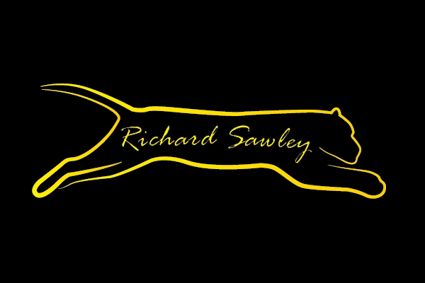
My logo is made out of an outline of a Jaguar. The Jaguar is running to represent my speed in finishing projects. The thickness of lines also changes to represent movement. The font matches the outline design and is curved to follow the direction of the Jaguars jump. In both designs, the strokes fade slightly at the edges to represent movement.

The logo was made in Adobe Illustrator CS6 with line outlines made with the pen tool. The lines are pressure based so they fade out on both ends. The outline create the feeling of the animal shape. The font is a similar technique with the faded outlines. The background is black to create contrast to the logo.

Thursday 26 September 2013

Judging Assignment


Title: Sloop Nassau
Artist: Winslow Homer
Date Created: 1899
Medium: Watercolor and graphite on off-white wove paper
Dimensions:  14 7/8 x 21 3/8 in. (37.8 x 54.3 cm)


Sloop Nassau is a very imitational art piece because you can clearly see that the paining is of a vessel in the middle a lake or sea. You can tell that the weather is a little stormy by the size of the waves and the dark color of the clouds.
                In terms of formalism the art piece contains a lot of elements and principles of design. The value in the water created a sense of depth and distance away from the shore. The cold color theme makes the art piece look appealing. The contrast between the water’s color and the sky’s color creates more emphasis on the vessel.
                The color tone of this art piece creates a cold emotion. The dark blue colors represent a stormy mood. The light brushstrokes add to this mood as well as the colors blurring with each other. Overall this piece wouldn’t quite put a smile on your face.

Tuesday 24 September 2013

Logo Project

My logo will feasible consist out of a Jaguar or another fast animal to show my work speed. The Jaguar will be in a jumping pose and the Typography will be inside the shape of it.

Thursday 19 September 2013

Profile Picture

My profile picture represents me because it shows a rough picture of me. To alter this image I used 2 artistic photoshop filters and some lighting adjustments. The changes made me look more anonymous and make the picture more contrasty.

Written Component


I created a scene of rhythm in both designs by angling all the lines in a 45-degree angle and using the same distance apart from them. The first rhythm design is simple and steady. It is made out of lines that are all the same width but different height. The second design is more dynamic, because the lines have value and there is movement represented with the wavy lines. The second design works better because it has more movement and variety. Both design are pleasant to the eye.